DigIt is a game for mobile phones I made during the Game Design & Development course at the Utrecht School of the Arts. Before we actually made a working version, I had already used the game concept by itself to apply for that course. The finished game was well received and very much complete, but after the project was officially over I saw some opportunities to improve the game even further. That’s what this article is about.

So, before you continue, please take a look in my portfolio to see how DigIt works exactly. It’s been a while since we completed DigIt, but I thought the design notes I made then (while playing the game on my Nokia 7610) would make for an interesting article about hands-on game design. We’ll start off with the one change to the game mechanics and then review the interface to better support gameplay.
Simpler level meter, simpler game
The old level meter, including the minimum indicator
The change in the game design is actually pretty simple. It’s more of a removal than it is a change, really. Before we get to what’s going to happen, let’s take a look at the current situation. DigIt uses a level meter, which shows your progress in the current level. Fill it up and you proceed to the next level. Currently the level meter includes a minimum indicator. This is where the level meter starts after leveling up and it allows the player to make some errors, because the game is over if your level meter is empty. This meter is depleted by pressing the wrong number or pressing at an incorrect time. After watching other people play and playing the game extensively myself, I figured out that this minimum indicator on the level meter was completely absolete. The game already contained another way you could lose: running out of allowed errors. This was something people understood, while the use of the small line on the level meter was kind of unclear, as was the meter going down.
Losing based on level progress or on overall game performance didn’t need to be both present and getting rid of this little interface item would make the game as a whole even more simple and easy to understand. This conclusion would improve the game in multiple ways. First, the line on the level meter would be gone, not raising any questions on what it is and does. Second, the level meter doesn’t have to be able to go down, it only has to go up. Third, the only thing you have to watch out for is the number of errors you can still make. Of course, in theory this would make the game a little easier. It is possible for the player to have more allowed general errors than the previous level meter would allow before failing. But at the moment this would become an issue, it is still unlikely that the player would make so many errors in a row that the level meter would run out before the number of allowed errors. I mean, the meter also increases on correct button presses, while the allowed errors only increase on going to the next level. The level in which players start running into trouble should be about the same.
DigIt already is a pretty simple game, but changing the level meter and connected mechanics in the ways proposed will hopefully make it even more understandable and fun to play. Looking at how often the first version of the game was played, it’s amazing this is the only thing I ran into. It just goes to show that even a small game like this can benefit from playtesting and you’re not likely to get everything right the first time.
Interface iterations
As DigIt ran on my old Flash Lite 2.0 enabled Nokia 7610, I was able to play the game extensively myself and show it to anybody that would like to play it. This resulted in the proposed design change above, but it also made me more aware of how the game actually played on a mobile phone. I wasn’t really a mobile gamer, other than playing on my DS and PSP, and during development on PC you look at the game very differently. We did build small prototypes back then, testing whether new implementations would actually work on the intended platform. But these were more technical tests than usability tests, something that we could do with the version that we had at the end of the project. And even though DigIt plays really well, even on a phone with the weirdest number pad ever, there is still room for improvement. Before I discuss the thought and design process in reinventing the visual interface, I’ll first name every interface element so you’ll know what I’m talking about when addressing them individually. Below is a DigIt screenshot with numbered interface explanations.
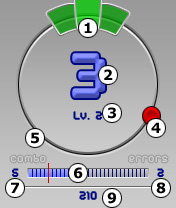
Original DigIt interface
- Scoring area: Three hit areas where you can stop the ball to score points. One center, two sides.
- Number indicator: Displays the current number key you have to press to stop the ball.
- Level: The number of the current level you’re in.
- Ball: The ball you have to stop inside the scoring area by pressing the number displayed.
- Path: Shows the path of how the ball will move on screen.
- Level meter: Displays your progress within the current level.
- Combo: The number of consecutive correct button presses, acting as a score multiplier.
- Errors: The amount of errors you are still allowed to make before you go game over.
- Score: The points you collected up until now.
As you can see, the level meter still contains the red line as the minimum indicator. When looking at this interface and playing the game this way, there were two conclusions I made to what was wrong with it:
- There should be a stronger visual indication of the level progress. When you’re paying attention to the number and scoring area, it’s hard to see how far you actually are from leveling up.
- The same goes for the error and combo numbers. These should be closer to the scoring area, because it is information the player requires all the time.
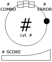
Result of iteration 1
This resulted in the first schematic redesign. The error and combo numbers have been moved up, so you can view them more easily when watching the scoring area. The level meter lost its minimum indicator and grows larger towards the right, with the blocks there changing color more noticably. The score has been repositioned to take better advantage of the screen space left open by the new level meter. As you can see, the position of a lot of interface items has remained the same. When looking at this ‘improved’ interface, I again noticed two things that might be interesting to look at:
- The level number is pretty far away from the level progress. It is possibly better to connect these two things visually, because they are functionally connected as well.
- The score is placed all the way at the bottom of the screen, it can’t possibly be farther away from the attention center at the top of the screen. Your score might be interesting to see, especially when you’re getting close to the highest score.
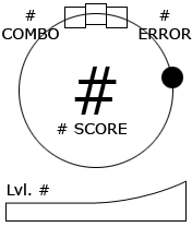
Result of iteration 2
Take a look at the next schematic redesign. Nothing much has changed really. The score is now positioned below the number to press and the level number that was once there is now placed at the score’s old location. Not much of an improvement, is it? Logically it might be, but it still didn’t feel right. This time, there were three things that came to mind:
- The area where the action is going on (scoring area, combo, errors) is separated from the area where the progress can be seen (level meter, level number, score).
- More importantly, when looking at the physical characteristics of a mobile phone, the action area is very separated from the number buttons on the hardware. This means you have to look far away from the action area when trying to visually locate the button you should press.
- Repositioning the score number is actually more confusing for gameplay. It is updated at the same time as the number you should press and at the very start of the game, your score is so low that it could be the same as a possible number to press.
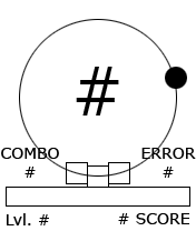
Result of iteration 3
This resulted in the final schematic interface redesign for DigIt. The upper part of the screen is now not used at all, only for the ball to pass through. The most important change is that the scoring area has been moved to the lower part of the screen, the error and combo numers went along with it. The level progress, level number and score now have a more neat position at the bottom of the screen. This way, all relevant information is grouped together and very close to the part of the hardware used to play the game. The level meter’s shape has changed a bit, to allow a calmer composition. Showing the player is nearing the end of a level can also be done with other visual methods.
A big change
The version of DigIt now available in my portfolio is still the old version, as I moved on to other projects and a full time job in game development since then. Quite some time has passed since I made DigIt and much has changed in the world of mobile phones and their games. To make it work now, it would probably need another, bigger redesign. I already had some brainstorms with my former DigIt colleague about this, but we’re both too busy with the games at our jobs to actually work on it. Writing this article got me motivated, though…


No comments have been left for this post.